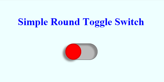
A short while ago, I published a post that created a CSS Toggle Switch in it’s very basic form. Here we use the same code, changing class names, and add a couple of other tweaks to make a similar toggle switch. Now it’s round and we’ve added some shadowing to make it look slightly better. Nonetheless, it’s still a very basic piece of code. The code assumes some level of understanding with CSS/HTML. (click here for demo)
For a look at the code in more depth, please see Simplest Toggle Switch as here we only look at the couple of bits added or changed from that code.
We have simply changed the border radius to 40 pixels from 10 pixels in two places (tgWrapper and tgLabel) and added box shadow in two two places (tgWrapper and tgLabel). That’s it. Simple as can be.
simpleroundtoggleswitch.css
			*{
				margin: 0;
				padding: 0;
			}
			body{
				background-color: #eeffff;
				text-align: center;
			}
			#tgH1{
				padding: 50px;
				color: #0000ff;
			}
			.tgWrapper{
				position: relative;
				left: calc(50% - 50px);
				width: 100px;
				height: 50px;
				background-color: #bbb;
				border: 1px ridge #888;
				border-radius: 40px;
				box-shadow: -8px 5px 6px #888888 inset;
			}
			.tgLabel{
				position: absolute;
				width: 44px;
				height: 44px;
				left: 0;
				top: 0;
				cursor: pointer;
				background-color: #ff0000;
				border: 3px solid #dd0000;
				border-radius: 40px;
				transition: left .4s ease-in-out;
				box-shadow: -8px 5px 8px #888888;
			}
			.tgInput{
				opacity: 0;
				width: 100%;
				height: 100%;
				cursor: pointer;
			}
			.tgInput:checked ~ .tgLabel{
				left: 50px;
				background-color: #00ff00;
				border-color: #00dd00;
			}
simpleroundtoggleswitch.html
<!doctype html>
<html lang="en">
	<head>
		<meta charset="UTF-8">
		<title>Simple Round Toggle Switch</title>
		<link rel="stylesheet" href="simpleroundtoggleswitch.css" />
	</head>
	<body>
		<h1 id="tgH1">Simple Round Toggle Switch</h1>
		<div class="tgWrapper">
			<input type="checkbox" id="tgInput" name="tgInput" class="tgInput">
			<label for="tgInput" class="tgLabel"></label>
		</div>
	</body>
</html>
